
Building Custom Visuals to Extend Power BI’s Capabilities
By Daniil Slesarenko
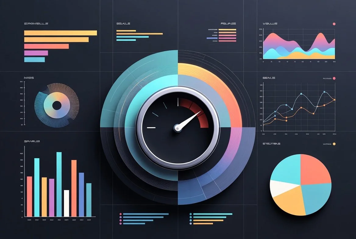
Power BI is one of the most powerful business intelligence platforms available today. With a rich library of built-in charts, tables, and maps, it enables organizations to turn raw data into actionable insights quickly. However, as analytics needs mature, many teams discover a ceiling: standard visuals are not always enough.
This is where custom Power BI visuals come in.
Custom visuals allow organizations to extend Power BI beyond its default capabilities, enabling richer analytics, better user experiences, and insights that align more closely with real business workflows.
Why Custom Power BI Visuals Matter
Out-of-the-box Power BI visuals are designed to solve common reporting scenarios. Bar charts, line graphs, matrices, and KPIs work well for many use cases—but not all.
Organizations often face challenges such as:
Representing complex relationships or flows in data
Visualizing industry-specific metrics
Applying advanced interaction logic or calculations
Enforcing custom branding and UX standards
Making large or dense datasets easier to interpret
Custom visuals bridge this gap by allowing teams to design purpose-built visualizations tailored to their data, users, and decision-making processes.
What Are Power BI Custom Visuals?
A Power BI custom visual is an extension built using the Power BI Visuals SDK. These visuals integrate directly into Power BI Desktop and Power BI Service, behaving like native components while offering far greater flexibility.
Key characteristics:
Built using TypeScript, HTML/CSS, and libraries such as D3.js
Fully interactive with Power BI features like filtering, cross-highlighting, and tooltips
Can be deployed privately within an organization or published publicly via AppSource
Operate within a secure, sandboxed environment
From a user’s perspective, a custom visual feels native. From a developer’s perspective, it unlocks fine-grained control over data rendering and behavior.
When Built-In Visuals Aren’t Enough
Custom visuals are particularly valuable in scenarios where standard charts struggle to convey meaning.
Common use cases include:
Advanced KPIs that combine multiple metrics, thresholds, and states
Process and flow analysis using Sankey diagrams or network graphs
Time-based visualizations such as timelines, roadmaps, or event sequences
Operational dashboards with dense, real-time data
Industry-specific analytics (finance, telecom, manufacturing, healthcare)
In these cases, forcing data into a generic visual often leads to cluttered dashboards and misinterpretation. A custom visual can be designed to match how users actually think about the data.
How Custom Power BI Visuals Are Built (High Level)
At a high level, building a custom visual involves four core components:
Data Binding
Defining how Power BI passes dataset fields into the visual (measures, categories, values).Rendering Layer
Translating data into graphics using SVG or Canvas for precise control and performance.Interactivity & Logic
Handling selections, filtering, drill-downs, and user interactions.Formatting & Configuration
Exposing properties in the Power BI formatting pane so users can customize appearance and behavior.
The development workflow uses Microsoft’s Power BI CLI tooling and integrates seamlessly into Power BI Desktop for testing and iteration.
Key Design, Performance, and Security Considerations
Building a custom visual is not just about appearance—it requires careful engineering.
Design & UX
Keep visuals intuitive and aligned with Power BI interaction patterns
Avoid overloading users with too much information at once
Ensure accessibility (color contrast, readability, tooltips)
Performance
Optimize rendering for large datasets
Minimize unnecessary redraws
Efficiently aggregate and process data
Security & Governance
Custom visuals run in a sandboxed environment
Limited API access protects data integrity
Certified visuals follow Microsoft’s security and quality standards
Internal visuals should follow versioning and governance controls
Well-designed visuals enhance dashboards; poorly designed ones can degrade performance and trust.
Build vs Buy: Choosing the Right Approach
Before building a custom visual, it’s important to evaluate existing options.
Buy or reuse when:
A certified AppSource visual meets 80–90% of your needs
Time-to-value is more important than customization
Ongoing maintenance resources are limited
Build when:
The visual supports a core business process
Data logic or interaction is highly specific
Branding or UX differentiation matters
Long-term analytics strategy benefits from in-house IP
In many cases, organizations start by buying and later build custom visuals as analytics maturity increases.
The Business Impact of Custom Power BI Visuals
When implemented correctly, custom visuals deliver tangible value:
Clearer insights and faster decision-making
Higher dashboard adoption by business users
Reduced reliance on external BI or visualization tools
Better alignment between analytics and real-world operations
Competitive advantage through differentiated reporting
Custom visuals turn Power BI from a reporting tool into a strategic analytics platform.
Final Thoughts
Power BI’s strength lies in its extensibility. Custom visuals unlock that potential by allowing organizations to move beyond generic dashboards and toward analytics experiences designed for their specific needs.
Whether you are solving a complex visualization challenge or looking to elevate how your data is consumed, custom Power BI visuals are a powerful investment in better intelligence.